European Route Planning
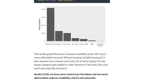
A technical guide on importing and visualizing FlixBus's European GTFS transit data in PostgreSQL using pgRouting for route planning.
A guide to using color scales effectively and accessibly in data visualizations with the D3.js library, including practical examples.
Introducing the starBliss R package for creating custom, framed constellation maps based on location and date using ggplot2.
A humorous analysis exploring the correlation between the number of metal bands per capita and national happiness scores in European countries.
A guide to creating and using interactive dual-axis line charts in Plotly for Python, with examples comparing sensor data.
A tutorial on visualizing mixed effect regression models and their uncertainty using non-parametric bootstrapping in R with ggplot2.
A guide on using the scales package in R's ggplot2 to format axes with natural log and base 10 log scales for better data visualization.
Introduces new _flex() functions in the mapBliss R package for custom, per-label positioning on maps, enhancing map art creation.
A tutorial on creating biomass pyramid and funnel plots using ggplot2 in R, including code examples and customization tips.
A tutorial on visualizing custom statistical models, including linear and non-linear fits, using ggplot2 in R for data science workflows.
A technical walkthrough of visualizing and improving a graph of Auckland bus cancellation data using R, focusing on data representation and coding techniques.
A guide to creating data visualizations using KQL in Azure services like Sentinel and Log Analytics, with practical examples.
A guide to creating ASCII bar charts directly in PostgreSQL using SQL queries, eliminating the need for external visualization tools.
A technical tutorial on web scraping and text analysis using R and ggplot2 to analyze descriptions of US Wilderness Areas.
A recap of a 2-day workshop on creating advanced, visually appealing graphics using the ggplot2 package in R, taught at rstudio::conf 2022.
A guide to using the Python wrapper for Apache ECharts to create and render interactive charts as static images.
A guide to using Python's Altair library for data visualization, comparing it to tools like Tableau, and showing setup and examples.
A tutorial on generating stylized maps in Python using the prettymaps library, OpenStreetMap data, and vsketch for rendering.
A tutorial on solving overlapping x-axis label issues in ggplot2 using techniques like plot resizing, axis swapping, and label rotation.
A tutorial on using the R magick package to programmatically add semi-transparent color overlays to images for better text readability.