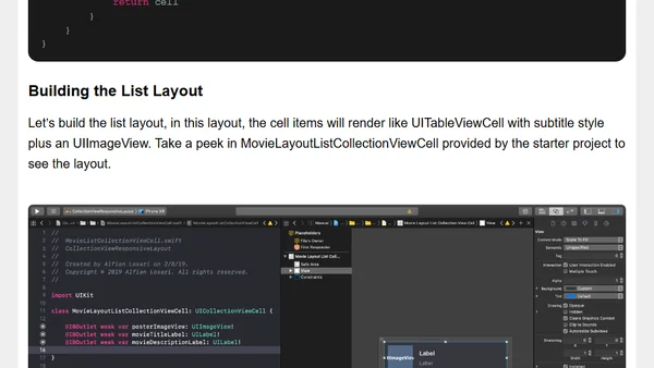
Building Responsive and Adaptive iOS App with UICollectionView
A tutorial on building a responsive iOS movie list app using UICollectionViewFlowLayout, adapting to different screen sizes and layouts.
A developer details the typography and responsive design overhaul of their personal website, inspired by a book on practical typography.
A technical guide to creating responsive Flexbox layouts that switch between horizontal and vertical columns using flex-basis, without media queries.
A developer's quest to solve a specific CSS Flexbox layout problem without using media queries, culminating in a JavaScript-based solution.
A case study on solving a complex, responsive layout challenge with CSS Grid, focusing on aligning dynamic content under specific constraints.
Explores the future of responsive web design, moving beyond screen size to consider user context like location, light levels, and device preferences.
A tutorial on building a responsive form layout using CSS Grid, covering column definitions and vertical alignment.
Explains how to use CSS Variables (Custom Properties) to position CSS Grid items relative to each other, enabling dynamic layouts.
A guide to managing responsive design breakpoints in SCSS using Sass maps and custom mixins for cleaner, more maintainable CSS.
Explores using the Network Information API to create web components that adapt to a user's connection speed and type.
Part 14 of a series on building an app with Angular and ASP.NET Core, focusing on making the product card and shopping cart responsive.
Explores how CSS Grid can break standard web layouts and inspire more creative, flexible designs for the future.
Analysis of Apple Watch's new web content support, detailing WebKit optimizations and developer meta tags for watch-specific layouts.
A technical guide to creating CSS Grid layouts with aspect-ratio cells using CSS variables and the padding hack.
Announcing a new book about web typography, exploring the unique challenges and opportunities of typesetting for the web.
Explains how to use the CSS Grid minmax() function to create flexible, responsive layouts without media queries.
A tutorial on building a responsive admin dashboard layout using CSS Grid, including code examples and cross-browser considerations.
Explores combining CSS Variables with CSS Grid to create dynamic, responsive layouts with cleaner, more maintainable code.
A curated collection of popular and useful CSS snippets for responsive design, text selection, clearfix, box-sizing, and modern layouts.
Explains the key differences between auto-fill and auto-fit keywords for responsive column sizing in CSS Grid layouts.