The Flexbox Holy Albatross Reincarnated
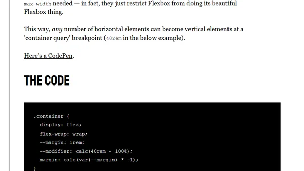
Read OriginalThis article explains an advanced CSS Flexbox technique called the 'Holy Albatross,' which uses flex-basis and custom properties to create container-query-like responsive layouts. It demonstrates how to switch between multi-column and single-column designs based on container width, without min-width or max-width restrictions, and includes examples with CodePen links and IE compatibility notes.
0 comments
Comments
No comments yet
Be the first to share your thoughts!
Browser Extension
Get instant access to AllDevBlogs from your browser
Top of the Week
1
The Beautiful Web
Jens Oliver Meiert
•
2 votes
2
When your coding agent doesn’t understand your project, you’ll get junk
Benjamin Cane
•
1 votes
3
LLM Use in the Python Source Code
Miguel Grinberg
•
1 votes
4
Wagon’s algorithm in Python
John D. Cook
•
1 votes
5
An example conversation with Claude Code
Dumm Zeuch
•
1 votes