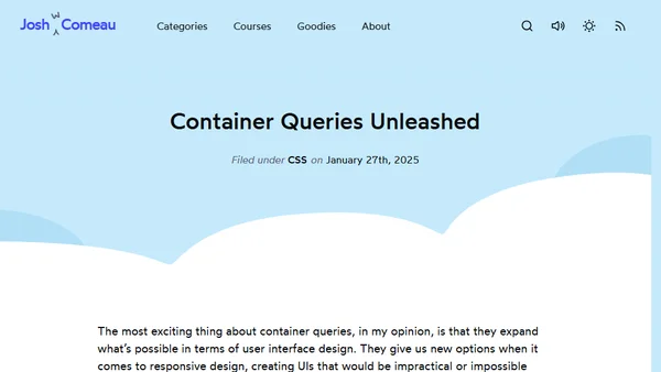
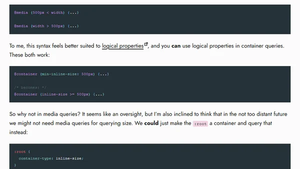
Container queries are rad AF!
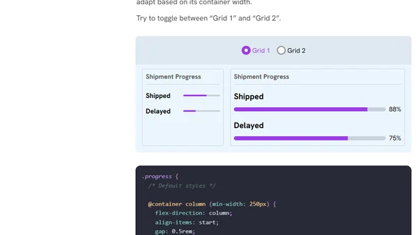
An introduction to CSS container queries, explaining their use case for component-based responsive design beyond viewport media queries.
A tutorial on implementing common website layouts like two-column and sidebar navigation using CSS Grid, with responsive design examples.
Explains the CSS clamp() function for responsive design, covering its syntax, use cases, and advantages over media queries.
A technical article explaining how to randomize the visual order of items in a CSS Grid using CSS custom properties and minimal JavaScript.
Explores three CSS snippets for conditionally applying border-radius to prevent visual issues when elements touch viewport edges.
Explores the CSS field-sizing property, demonstrating its use cases for dynamic form and UI element sizing based on content.
Introducing the new CSS progress() function for creating smooth, responsive visual effects without complex calculations or JavaScript.
The author proposes a new CSS feature called 'inner breakpoints' for responsive element layouts, comparing it to media and container queries.
A guide to using CSS container queries for responsive design, focusing on a practical layout pattern for email metadata.
A SwiftUI developer shares a strategy using ViewThatFits to create responsive UI text that adapts to accessibility settings like dynamic type.
A tutorial on using modern CSS container queries and the :has() selector to create a responsive feature image component with dynamic caption styling.
The author details the latest redesign of their personal website, version 7.0, focusing on new sidebars, a light-dark theme, and Bluesky integration.
An introduction to CSS Container Queries, explaining their importance and how to use them for component-based responsive design.
Explores using logical properties in CSS media queries and container queries, discussing syntax improvements and current limitations.
A nostalgic look at the HTML <area> element and image maps, comparing them to Tamagotchis and discussing early 2000s web design practices.
A technical article discussing responsive design challenges and proposing better CSS composition strategies for complex layout changes across breakpoints.
A developer reflects on a decade of coding, from a first responsive layout to the joy of interactive web creation.
An interactive guide explaining CSS container queries, their purpose, and how to implement them for responsive component design.
A quick guide to creating a 'minimum full height' layout using Tailwind CSS, explaining the key classes and markup structure.
Learn how to use CSS's height: auto to override HTML image dimensions for responsive design without distortion.