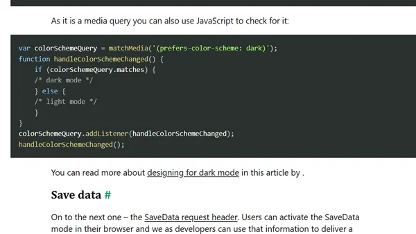
Dark mode
A developer details implementing a dark mode toggle using CSS, media queries, localStorage, and tools like Claude Code and ImageMagick.
A beginner's guide to CSS layout techniques including Flexbox, Grid, and responsive queries for web development.
The author proposes a new CSS feature called 'inner breakpoints' for responsive element layouts, comparing it to media and container queries.
Explores using logical properties in CSS media queries and container queries, discussing syntax improvements and current limitations.
A guide exploring modern responsive web design techniques, including fluid layouts, container queries, and user preference media queries for 2023 and beyond.
Explains how to use CSS media queries like prefers-reduced-motion and prefers-color-scheme to create accessible, personalized, and battery-friendly websites.
A guide on using CSS media queries and custom properties (variables) together to create more manageable and maintainable responsive web designs.
Explores how the CSS prefers-color-scheme media query prioritizes app-level theme settings over OS-level preferences, with practical testing examples.
Explains how to use CSS Level 5 media queries (hover, pointer) to detect hover-capable devices for better responsive design and accessibility.
Exploring the theme-color meta tag in Safari, including implementation for light/dark modes and JavaScript integration.
Explores the future of CSS layout, comparing the roles of @container queries and traditional @media queries in responsive web design.
Explores the next era of responsive web design, moving beyond viewport media queries to user preferences, container queries, and component-driven styles.
A developer discusses the need for better browser dev tools to debug modern CSS media queries like dark mode and reduced motion preferences.
A guide to identifying and solving responsive design issues for intermediate screen sizes, often overlooked between mobile and desktop breakpoints.
A tutorial on implementing dark mode for websites using CSS custom properties and the prefers-color-scheme media query.
A technical guide on implementing a dark mode theme for a website using CSS custom properties and the prefers-color-scheme media query.
Explores browser features for detecting user preferences like reduced motion and dark mode using CSS and JavaScript media queries.
A developer's quest to solve a specific CSS Flexbox layout problem without using media queries, culminating in a JavaScript-based solution.
A guide to managing responsive design breakpoints in SCSS using Sass maps and custom mixins for cleaner, more maintainable CSS.
Explains a historical Safari bug with em-based media queries and why pixels were the recommended unit for consistent responsive design.