Creative CSS Layout (and the Flexible Web)
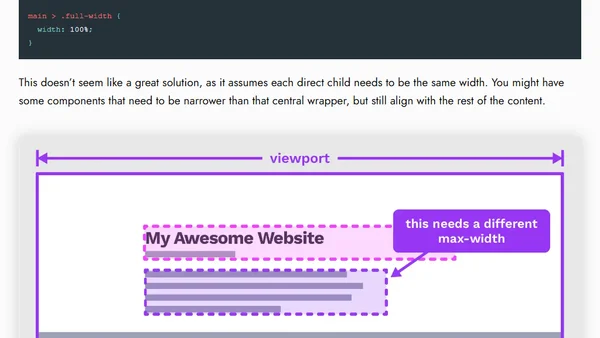
A talk on modern CSS layout techniques, emphasizing flexibility and new features like Container Queries and :has().
CSS container queries are now supported in modern browsers, enabling responsive component design based on parent container size instead of viewport.
Explains the new CSS @container queries and :has() selector, their synergy for responsive design, and how to use them in Chromium 105.
Explains how CSS logical properties like padding-inline provide shorthands for setting spacing on a single axis, improving code maintainability.
A developer discusses the importance of testing websites on ultrawide (21:9) screens, not just standard 16:9, and provides a simple method for emulating these resolutions.
A CSS tutorial on techniques for creating full-width components within a centrally constrained layout, discussing markup and styling solutions.
Ahmad Shadeed's Defensive CSS is a detailed resource of techniques for building resilient, robust front-end user interfaces.
A guide to using the CSS aspect-ratio property for responsive design, with syntax and visual examples.
Argues against desktop-first web design, advocating for a mobile-first approach to improve user experience across all devices.
A developer argues for using HTML and CSS as the ultimate responsive design tool, critiquing visual design tools like Figma and Webflow.
Explores when to use pixels vs. ems/rems in CSS for optimal web accessibility, arguing both are necessary.
A CSS tutorial on creating a dynamic line separator between flexbox items that adapts to screen size, using pseudo-elements and flexbox properties.
Explains why using vw/vh units for font sizes creates accessibility and layout issues, and recommends using em, rem, and clamp() instead.
A technical deep dive into building the Designcember holiday calendar site, covering responsive design, CSS techniques, and development tools.
A guide on using CSS media queries and custom properties (variables) together to create more manageable and maintainable responsive web designs.
A technical guide to optimizing hero videos on landing pages for faster load times and better UX, covering aspect ratios and layout shifts.
Explains a clever CSS technique used by Facebook to conditionally toggle border-radius based on element width vs viewport width.
A guide for front-end developers on making strategic decisions to build flexible, adaptable UI components that handle real-world content and diverse user needs.
Explores whether modern CSS layout tools like flexbox and Grid make traditional 12-column design grids obsolete for web development.
A proposal for browser dev tools to toggle CSS size units (px, em, rem) like color values, improving designer-developer workflow.