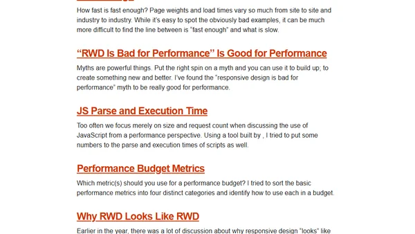
2014 Favorites
A review of the five most popular web performance and responsive design articles from 2014, discussing speed, myths, and metrics.
Explains the mobile-first CSS approach, its benefits over desktop-first, and provides practical code examples for responsive web design.
A review of Scott Jehl's book 'Responsible Responsive Design', covering advanced responsive web design techniques, performance, and accessibility.
Explores the evolution and future capabilities of CSS media queries, moving beyond screen size to adapt to user environment and device features.
A tutorial on creating off-canvas layouts using the Susy grid system for web development.
A guide to making responsive websites compatible with older browsers like IE8 using the Respond.js polyfill.
A guide to making embedded SVG images responsive across browsers using CSS techniques like the Padding Hack and inline media queries.
A tutorial on using Susy's background grid image for debugging responsive layouts across multiple breakpoints.
A tutorial on organizing responsive CSS layouts using Sass maps and the Susy grid framework for better maintainability.
A tutorial on configuring and using static grids with the Susy 2 CSS layout framework, including responsive breakpoints.
A deep dive tutorial on using Susy 2 and the Breakpoint gem to create responsive website layouts with Sass.
A technical case study on building responsive, accessible websites for Radio Free Europe to reach users with slow connections and old devices.
Introducing FitFrame.js, a jQuery plugin for making embedded iframes like YouTube and Vimeo videos fully responsive on websites.
Explores using CSS Regions and pseudo-elements to create semantic, responsive ad layouts without bloating HTML markup.
A guide to various techniques for implementing responsive typography on websites, covering media queries, viewport units, and accessibility.
A guide to using CSS Shapes to create non-rectangular layouts and wrap content in custom shapes, covering basic properties and browser support.
A tutorial on using the Susy grid framework plugin for Compass and Sass to create custom responsive layouts.
Summary of Luke Wroblewski's 2013 talk on designing mobile web experiences for write/read interactions, focusing on one-handed use and simplified flows.
A guide on using CSS to maintain the aspect ratio of embedded iframes (like videos) in responsive web design.
Introducing the hippify JavaScript plugin for swapping high-resolution images on high-PPI, non-mobile displays.