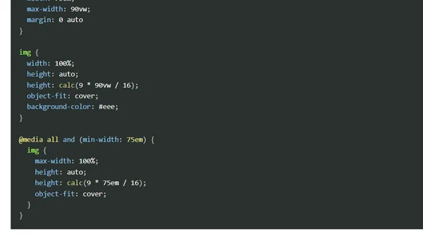
PX, EM or REM Media Queries?
A technical analysis comparing the use of px, em, and rem units in CSS media queries, testing their behavior under different conditions.
Explores practical use cases for CSS container queries, a proposed feature for responsive web design, with code examples for modular components.
A technical comparison of CSS relative units REM and EM, explaining their differences, use cases, and best practices for web typography.
A front-end developer's wishlist for 2016, focusing on container queries, Service Worker adoption, and new CSS selectors.
A technical guide on using CSS Flexbox to create responsive, self-adjusting grid layouts that handle dynamic content elegantly.
Explains CSS techniques to define image aspect ratios, preventing layout reflow and improving page load experience.
A developer shares three reusable SASS mixins for media queries, element centering, and fade transitions to improve CSS workflow.
Explains the difference between CSS units 'em' and 'rem' for relative sizing, with practical examples.
Explores various CSS properties (display, visibility, opacity, position) for hiding elements, detailing their visual, functional, and accessibility implications.
A guide to building a multi-level dropdown navigation menu that is fully accessible across mouse, touch, keyboard, and screen sizes, with JavaScript fallback.
A 2015 roundup of browser updates, new web features, and developer tools for debugging, testing, and performance.
Explains the differences between CSS viewport units (vw, vh) and percentage units, detailing when to use each for responsive layouts.
A guide to using the SVG viewBox attribute for art-directing and cropping SVG images, with tips and a call for a CSS viewBox property.
Weekly roundup of browser developer news, covering Firefox 38 features, ServiceWorker, HTTPS, and debugging tools.
A comprehensive guide to implementing favicons and touch icons across browsers, covering formats, HTML declaration, and browser compatibility.
A guide to CSS font sizing units, explaining the differences between absolute (px, pt) and relative (em, rem, %, vw) units with practical examples.
Explains the importance of the viewport meta tag for true responsive design on mobile devices, beyond just CSS media queries.
A developer creates a custom Sass mixin for media queries using Sass Maps, improving on the popular Breakpoint library.
A technical guide on implementing dynamic, responsive background images using CSS media queries and server-side logic like PHP.
A technical tutorial on creating a responsive, JavaScript-enhanced pop-out navigation menu with accessibility and mobile usability in mind.