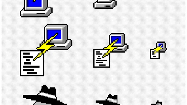
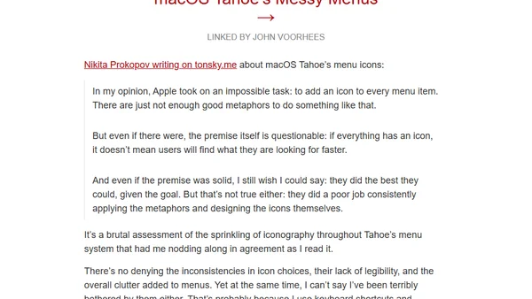
macOS Tahoe’s Messy Menus
A critique of macOS Tahoe's new menu icons, analyzing their inconsistent design, poor legibility, and questionable utility.
A history of the icon design for the PuTTY suite of tools, from hand-drawn origins to modern SVG versions.
Explores the new variable colors feature in SF Symbols 4 for Apple platforms, allowing icons to adapt dynamically to numeric values like signal strength.
A developer explains why they switched from icon fonts to SVG for web icons, citing performance, accessibility, and maintainability benefits.