macOS Tahoe’s Messy Menus
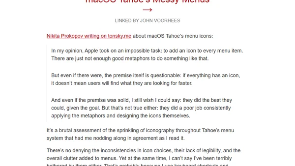
Read OriginalThis article analyzes the design of macOS Tahoe's new menu icons, arguing that the premise of adding an icon to every menu item is flawed. It criticizes the inconsistent application of visual metaphors, poor icon legibility, and the resulting menu clutter, while acknowledging that power users may be less affected due to reliance on keyboard shortcuts.
0 comments
Comments
No comments yet
Be the first to share your thoughts!
Browser Extension
Get instant access to AllDevBlogs from your browser
Top of the Week
1
The Beautiful Web
Jens Oliver Meiert
•
2 votes
2
When your coding agent doesn’t understand your project, you’ll get junk
Benjamin Cane
•
1 votes
3
LLM Use in the Python Source Code
Miguel Grinberg
•
1 votes
4
Wagon’s algorithm in Python
John D. Cook
•
1 votes
5
An example conversation with Claude Code
Dumm Zeuch
•
1 votes