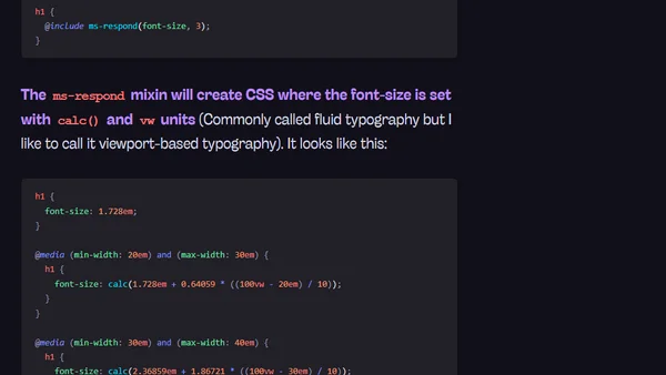
Changing Modular Scale Ratio at Different Breakpoints
Read OriginalThis article provides a detailed tutorial on implementing responsive typography using the Modular Scale method. It explains how to manually calculate and adjust font-size ratios at different viewport breakpoints, then demonstrates a more efficient approach using the Modular Scale Sass plugin to automate the calculations and streamline responsive design workflows.
Comments
No comments yet
Be the first to share your thoughts!
Browser Extension
Get instant access to AllDevBlogs from your browser
Top of the Week
1
The Beautiful Web
Jens Oliver Meiert
•
2 votes
2
When your coding agent doesn’t understand your project, you’ll get junk
Benjamin Cane
•
1 votes
3
LLM Use in the Python Source Code
Miguel Grinberg
•
1 votes
4
Wagon’s algorithm in Python
John D. Cook
•
1 votes
5
An example conversation with Claude Code
Dumm Zeuch
•
1 votes