CSS Findings From Twitter Design
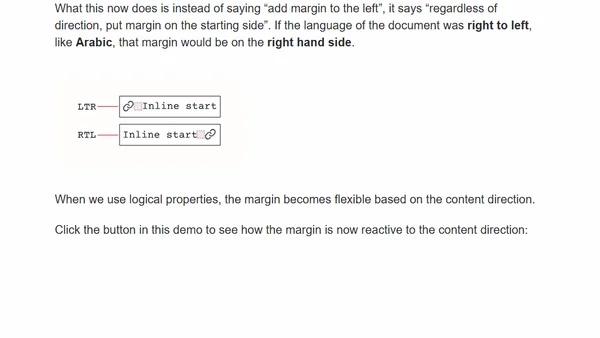
An analysis of interesting and unusual CSS techniques used in the Twitter website's design, including aspect ratios and negative margins.
Explains how to use the CSS column-count property to create responsive multi-column layouts, with practical examples.
Explores two methods for making CSS Motion Path animations responsive, addressing the challenge of scaling fixed-size paths for different viewports.
A developer explains using CSS vmin units for a fluid, responsive website layout that scales proportionally with the viewport.
A developer details the CSS flexbox and responsive design updates made to their personal photo journal website.
An introduction to CSS Logical Properties, explaining how they create flexible spacing that adapts to content direction and user language.
A guide to CSS viewport units (vw, vh, vmin, vmax) explaining their calculations, differences from percentages, and practical use cases like responsive typography.
Andy announces a live stream to redesign his microblog, focusing on web design and front-end development.
Andy introduces Utopia, a fluid typography tool, and discusses its algorithmic approach to responsive web design.
Andy Bell discusses the importance of remembering web history and standards while acknowledging the modern, diverse web development landscape.
Andy Bell introduces a simple mailto link generator tool and shares his background in front-end development and CSS education.
A guide to the various methods for hiding elements in web development, covering HTML, CSS, accessibility, and animation considerations.
A detailed guide to using min-width, max-width, min-height, and max-height CSS properties with practical examples and use cases.
A guide to implementing accessible hamburger menus for web navigation, covering common pitfalls and best practices for icons and toggle buttons.
A CSS Grid trick to create a contact list where all items share the width of the longest item, with alternative solutions using inline-block and inline-flex.
A tutorial explaining the CSS Flexbox layout model, covering core properties like flex-direction and flex-wrap for creating responsive designs.
An article exploring the unique mindset required to write effective CSS, focusing on its declarative nature and core concepts.
Explains CSS Grid's fr (fraction) units, covering their use for responsive layouts, common pitfalls, and how they interact with fixed tracks.
A CSS Grid tutorial on using pseudo-selectors to control the layout of leftover items (widows) in a grid, comparing it to flexbox solutions.
A practical guide demonstrating five real-world layout problems solved using CSS Flexbox, including headers, sidebars, and grids.