Everything I know about Responsive Web Typography
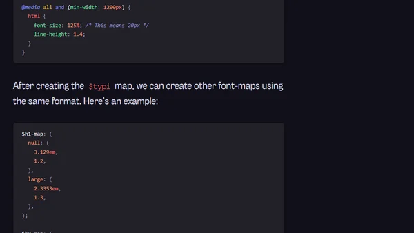
Read OriginalThe article details the author's journey and best practices for implementing responsive typography, including using relative units, vertical rhythms, and modular scales. It introduces a personal solution called Typi, which simplifies the process into three steps, and provides practical Sass code examples for adjusting font sizes and line heights across breakpoints.
0 comments
Comments
No comments yet
Be the first to share your thoughts!
Browser Extension
Get instant access to AllDevBlogs from your browser
Top of the Week
1
The Beautiful Web
Jens Oliver Meiert
•
2 votes
2
When your coding agent doesn’t understand your project, you’ll get junk
Benjamin Cane
•
1 votes
3
LLM Use in the Python Source Code
Miguel Grinberg
•
1 votes
4
Wagon’s algorithm in Python
John D. Cook
•
1 votes
5
An example conversation with Claude Code
Dumm Zeuch
•
1 votes