The Essence of Data Visualisation
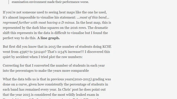
Read OriginalThe article critiques a data scientist's use of a heat map to visualize Kenyan KCSE exam results, arguing a line graph better illustrates a key point about grade regression in 2016. It discusses data normalization, historical grading curves, and emphasizes the importance of choosing the right visualization for clear interpretation in data science.
Comments
No comments yet
Be the first to share your thoughts!
Browser Extension
Get instant access to AllDevBlogs from your browser
Top of the Week
1
The Beautiful Web
Jens Oliver Meiert
•
2 votes
2
When your coding agent doesn’t understand your project, you’ll get junk
Benjamin Cane
•
1 votes
3
LLM Use in the Python Source Code
Miguel Grinberg
•
1 votes
4
Wagon’s algorithm in Python
John D. Cook
•
1 votes
5
An example conversation with Claude Code
Dumm Zeuch
•
1 votes