Yet Another How-to on Labelling Bar Graphs in ggplot2
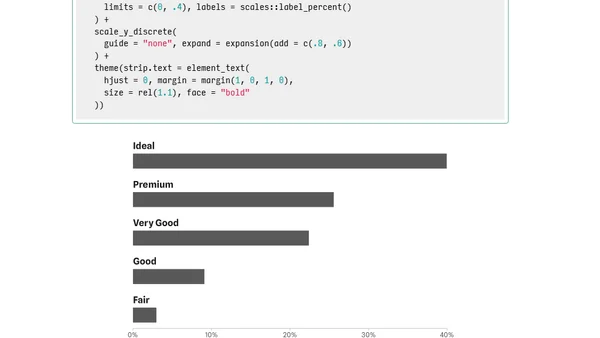
Read OriginalThis technical article provides a step-by-step guide for R users on labeling bar graphs in ggplot2. It covers data preparation using the diamonds dataset, creating basic horizontal bar charts, styling visualizations with custom themes and axis formatting, and specifically demonstrates how to position category labels above the bars. The content includes R code examples for calculating proportions, reordering factors, and applying percentage formatting.
Comments
No comments yet
Be the first to share your thoughts!
Browser Extension
Get instant access to AllDevBlogs from your browser
Top of the Week
1
The Beautiful Web
Jens Oliver Meiert
•
2 votes
2
When your coding agent doesn’t understand your project, you’ll get junk
Benjamin Cane
•
1 votes
3
LLM Use in the Python Source Code
Miguel Grinberg
•
1 votes
4
Wagon’s algorithm in Python
John D. Cook
•
1 votes
5
An example conversation with Claude Code
Dumm Zeuch
•
1 votes